Custom typography is one of the fastest ways to make a website feel like a brand instead of a template. It's also one of the easiest ways to accidentally slow a page down. Browsers have to fetch font files before they can render text in that font, and depending on how that process is set up, visitors either see invisible text, a flash of the wrong font, or headlines that jump around as the real typeface kicks in. None of that is necessary. With a few deliberate choices, you can keep your exact brand fonts and still have text appear quickly and predictably.
Why Custom Fonts Slow Down Text Rendering
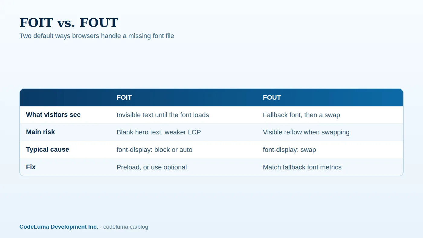
Every font file is a separate network request, and most brand fonts aren't installed on a visitor's device, so the browser has to download them before it can paint the text correctly. Until that download finishes, the browser makes a choice: hide the text, or show it in a fallback font and swap it later. Both choices are valid, but they have different trade-offs, and the default behaviour in many setups is worse than it needs to be. This is also directly tied to two metrics search engines and users both care about: Largest Contentful Paint and Cumulative Layout Shift. If your headline is your largest visible element, a slow or clumsy font swap can hurt both. We've covered the layout shift side in detail in our piece on stopping content from jumping around, and the render-timing side in our guide to fixing a slow hero element.

Understanding font-display: Your Most Direct Lever
The font-display property, set inside your font-face declaration, tells the browser how to behave while a font is loading. The value block hides text for a short period and then shows the fallback if the font hasn't arrived, which is where invisible text usually comes from. The value swap shows the fallback immediately and swaps in the real font whenever it's ready, even if that means a late layout shift. The value optional is the most cautious choice: the browser will use the custom font only if it loads fast enough, and otherwise sticks with the fallback for that visit entirely, avoiding a swap altogether.
There's no single correct value for every brand. If your typography is central to recognition, swap is usually the safer default. If you'd rather never see a layout shift, even at the cost of occasionally keeping a fallback font, optional is worth testing. What matters is that this is a deliberate choice, not whatever the browser or font service defaults to.
Subsetting: Shipping Only the Characters You Need
Most font files include far more than you'll ever use: full international character sets, symbols, and sometimes multiple scripts. If your site is in English and French, you don't need Cyrillic or Greek glyphs sitting in the same file. Subsetting strips a font down to only the characters your content actually uses, which shrinks file size, often substantially, and gets the font usable sooner.
The trade-off is maintenance: if you later add content in another language, you need to regenerate the subset to include those characters, or the browser will quietly fall back for any missing glyph. This is a small ongoing task, which is one of the reasons font strategy tends to live inside a broader maintenance plan rather than being a one-time setup.
Self-Hosting vs. Third-Party Font Services
Third-party font services are convenient, but every one of them adds a separate connection to another domain, and that connection has its own DNS lookup, handshake, and sometimes a redirect before the actual font file even starts downloading. Self-hosting removes that extra hop entirely: the font file comes from the same domain as the rest of your page, using the same connection the browser already opened.
Self-hosting also gives you full control over caching headers and the font-display value, instead of depending on whatever a third party sets. The usual argument against self-hosting is convenience, but once a font is downloaded, subset, and dropped into your project, it's a one-time task. If your hosting setup already includes proper caching and a content delivery layer, self-hosted fonts load quickly and consistently; this is a natural fit for managed hosting that's already tuned for performance.
Preloading the Fonts That Matter Most
A preload hint tells the browser to fetch a specific file early, before it would normally discover the need for it. For the one or two font files used in your most visible, above-the-fold text, usually your main body weight and maybe a heading weight, preloading can meaningfully shorten the gap between first paint and the final font appearing.
Preloading is not free, though. Each preloaded file competes for bandwidth with everything else loading early on the page, including your main stylesheet and hero image. Preload only the fonts that are visible immediately on load. Preloading every weight and style "just in case" slows down the exact thing you're trying to speed up.
Variable Fonts: One File Instead of Six
If your brand uses several weights of the same typeface, light, regular, bold, maybe a few in between, a variable font can combine all of them into a single file that the browser can render at any weight along that range. Instead of six separate downloads, you ship one file that's often smaller than two or three of the individual static weights combined.
Variable fonts aren't universally smaller than a tightly subsetted single-weight font, so this is worth testing rather than assuming. But for sites that genuinely use multiple weights across headings, body text, and UI elements, they tend to be a clear win on both file count and total size.

Matching Fallback Fonts to Prevent Layout Shift
Even with swap, you can avoid most of the visible jump by choosing a fallback font with similar metrics, roughly the same average character width and line height, to your custom font. Modern CSS also allows manual adjustment of a fallback font's size and spacing using properties like size-adjust and ascent-override, so the fallback occupies nearly the same space the real font will. Done well, the swap becomes nearly invisible: text appears instantly in the fallback, then quietly upgrades to the brand font without visibly moving anything else on the page.
A Practical Rollout Checklist
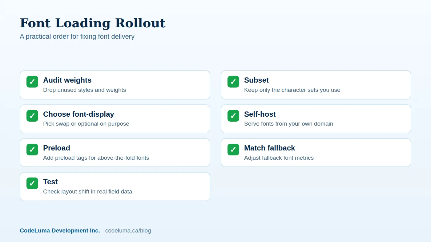
- List every font weight and style actually used on the site, and drop the rest
- Subset remaining fonts to your real language and character needs
- Decide on swap or optional for each font, deliberately, not by default
- Self-host font files on your own domain where practical
- Preload only the one or two fonts visible immediately on load
- Set fallback font metrics to reduce the visible swap
- Re-check Largest Contentful Paint and Cumulative Layout Shift after changes
Common Mistakes We See
The most frequent issue is simply not setting font-display at all, which leaves the browser's own default in place and often produces the worst of both options. Close behind is loading every weight a design file contains "to be safe," when the live site only ever uses three of them. We also regularly see preload tags added to every font on the page, which crowds out the more important above-the-fold request and can slow the page down overall. Finally, font services that silently change or version their files can quietly reintroduce delays months after a site first launched fast, which is part of why ongoing checks matter, not just a one-time fix at launch.
Wrapping Up
None of this requires giving up your brand's typography. Font-display gives you control over what visitors see while a font loads, subsetting and variable fonts cut down what has to be downloaded in the first place, and self-hosting with sensible fallback metrics removes most of the remaining delay and shift. The right combination depends on how central your typeface is to brand recognition and how much weight variety your design actually uses. If you're planning a new website or web application build or want a second look at an existing one, this is exactly the kind of detail worth getting right early, since it's far easier to set up correctly than to retrofit later.
Put this into practice with CodeLuma
CodeLuma builds font loading into every site from the start, choosing the right font-display behaviour, trimming files to what each page actually uses, and self-hosting on your own domain where it makes sense. If your current site shows blank text or jumpy headlines while fonts load, we can audit the setup and fix it as part of a broader {{svc:web|web build or performance pass}}.
- Website and web application development - fast, accessible, search-friendly builds.
- Managed hosting - monitored, backed-up, Canadian-friendly hosting.
- Maintenance and support plans - updates, monitoring and ongoing improvement.
- CodeLuma support - help from a real team when you need it.
Start a conversation. Tell us about your project and we will reply with practical next steps, or browse all CodeLuma services. CodeLuma Development Inc. is a Canadian company that works with teams in Windsor, Essex, London, Toronto, Mississauga and across Ontario, throughout Canada and remotely.