A visitor taps "Add to Cart," and at the exact moment their finger lands, an ad finishes loading above it and the button slides down. They end up tapping something else entirely — maybe a link to a different product, maybe an ad they never meant to click. That's Cumulative Layout Shift in action, and it's one of the most common ways websites quietly frustrate the people they're trying to convert.
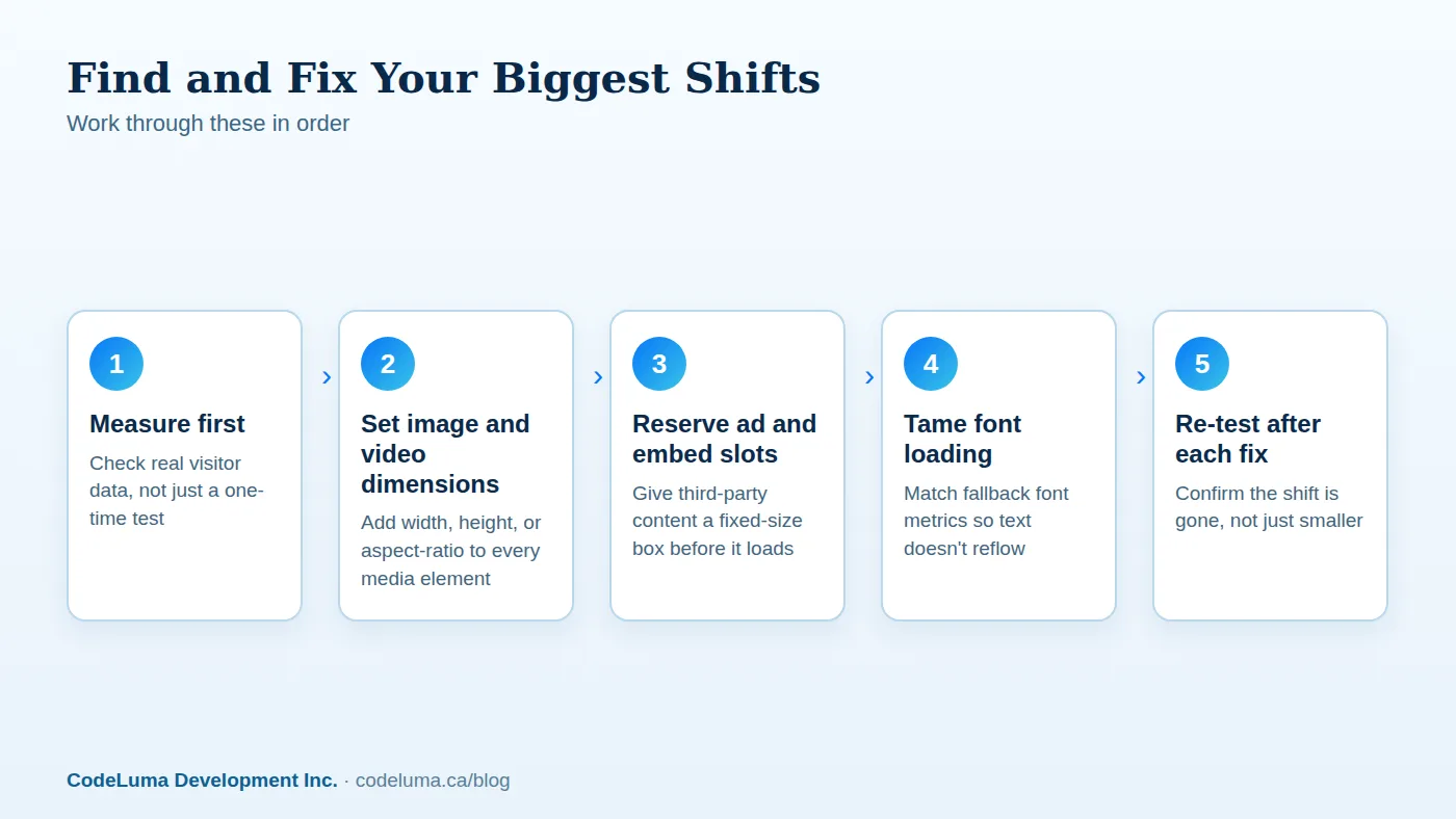
What Cumulative Layout Shift actually measures
Cumulative Layout Shift, or CLS, is one of the three Core Web Vitals Google uses to judge page experience, alongside loading speed and responsiveness. It tracks how much visible content moves around after it first appears, unprompted by anything the visitor did. A low score means the page holds still. A high score means text, buttons, and images keep shifting position as more of the page loads in.
It's measured as a score, not a count of pixels, because it factors in both how far things moved and how much of the screen was affected. A small shift across most of the viewport can score worse than a large shift in a tiny corner. The practical upshot is the same either way: it feels unstable, and visitors notice even when they can't name what's wrong.

Why a jumpy page costs you more than annoyance
Mis-clicks are the obvious cost. Someone means to close a popup and instead clicks through to an ad, or means to read the next paragraph and instead taps a link that just slid under their thumb. On mobile, where screens are small and thumbs are imprecise, this happens constantly on unstable pages.
There's a trust cost too. A page that jumps around reads as unfinished or poorly built, even if the underlying product or content is solid. And because CLS factors into how search engines assess page experience, a consistently shifting layout can be a quiet drag on visibility over time — not a penalty exactly, but one more signal working against you. We go deeper on the business side of this in our piece on full-stack performance and conversion.
Images and videos without reserved dimensions
This is the single most common cause. An image tag with no width or height tells the browser nothing about its final size, so the browser renders the page as if that image takes up zero space — then, the moment the image file finishes downloading, it snaps into place and pushes everything below it down the page.
The fix is simple and should be standard practice everywhere: every image and video element should carry explicit width and height attributes, or a CSS aspect-ratio rule, so the browser can reserve the correct box before the file ever arrives. Responsive images that change size across breakpoints still need a defined ratio — the box can resize with the layout, it just can't start at zero.
Ads and third-party embeds
Ad networks are notorious for this because ad sizes aren't known until the ad itself loads, and many networks don't tell the page how much space to hold aside. The result is a page that renders, settles, and then jumps as each ad slot fills in, sometimes more than once if the network swaps creative sizes.
The fix is to set a fixed minimum height on every ad container based on the smallest or most common size you expect, so the slot holds its shape whether an ad fills it in one second or ten. The same logic applies to social media embeds, maps, calculators, and any widget pulled in from somewhere else — if you don't control when it loads, you need to control the space it occupies before it does.
Web fonts and the late text swap
Custom fonts often load after a page's fallback system font has already rendered the text. When the real font swaps in, if its letters are a different width or height than the fallback, every line of text can reflow, pushing paragraphs and buttons around well after the page looked done.
Preloading your font files helps them arrive sooner, but the more reliable fix is choosing a fallback font with similar metrics to your custom one, or using CSS font-size-adjust so the fallback occupies close to the same space. It's a small detail that a lot of otherwise well-built sites skip.
Banners, cookie notices, and injected UI
Consent banners, promotional strips, and "subscribe now" bars are frequently injected into the page after everything else has rendered, shoving the whole layout down to make room. Visitors who were mid-scroll or mid-click get caught by the sudden jump.
Where possible, reserve the space for these elements in the initial layout rather than inserting them dynamically, or anchor them as an overlay that sits on top of the page instead of pushing content down. If a banner has to appear, it should take space that was already planned for it.
Dynamic content and infinite scroll
Lists that load more items as the visitor scrolls, or dashboards that swap in real data after an initial skeleton, can shift layout if the placeholder doesn't match the real content's size. This matters a lot for data-heavy interfaces — something we cover in more detail in our article on building internal dashboards.
The fix is to make skeleton loaders and placeholder states genuinely the same size as what replaces them, not just a rough guess. If a card can hold one line of text or three, decide on a fixed height that accommodates the typical case and truncates gracefully rather than growing the box after the fact.

How to reserve space properly
The underlying principle across every cause above is the same: decide the size of a thing before you know its exact content, and hold that space open. In practice that means:
- Set explicit dimensions or aspect ratios on images, videos, and iframes
- Give every ad slot and embed a fixed minimum height
- Match fallback font metrics to your web fonts, or accept a brief, stable wait
- Build banners and notices into the layout rather than inserting them after load
- Size skeleton states to match their real content, not a placeholder guess
None of this requires exotic tooling. It's mostly CSS discipline and a review pass on templates that get reused across a site. If your site is due for that kind of review anyway, our web development team can run through your templates and fix the specific elements causing shift, rather than guessing at general advice.
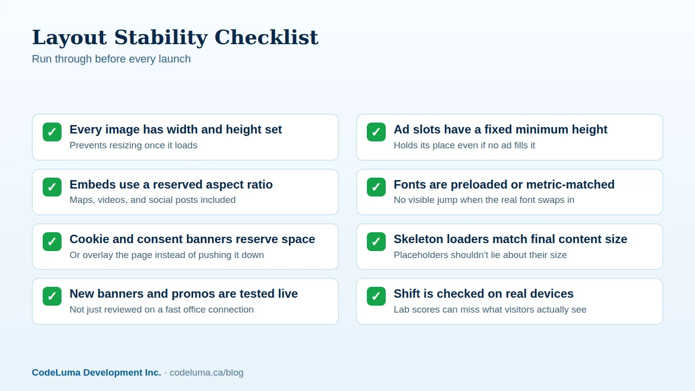
A short pre-launch checklist
Before pushing a new page or template live, it's worth running through a short list rather than relying on a single Lighthouse score:
- Every image and video has reserved dimensions
- Every ad slot and embed has a fixed minimum height
- Fonts are preloaded or metric-matched to their fallback
- Banners and consent notices don't push content after load
- Skeleton loaders match the real content's final size
- The page has been tested on an actual phone, on a slow connection
Common mistakes that keep CLS scores high
A few patterns show up again and again on sites that struggle with this:
- Fixing it only in the lab. A desktop test on fast wifi often looks fine while real visitors on mobile networks see every shift, because slower connections stretch out the window where unreserved content can land.
- Treating it as a one-time fix. A new ad network, a new embed widget, or a redesigned banner can reintroduce shift months after the original fix. This belongs in ongoing review, not a single cleanup sprint — the kind of ongoing attention covered under a maintenance and support plan.
- Reserving the wrong size. A placeholder that's close but not exact still causes a shift when the real content lands, just a smaller one. Precision matters more than people expect.
- Ignoring shift caused by user interaction. Content that expands when a visitor clicks something isn't counted the same way by CLS, but it can still feel disorienting if it happens far from where they clicked.
Where this fits with other performance work
Layout shift rarely travels alone. Pages with slow-loading hero images often have both a Largest Contentful Paint problem and a CLS problem, since the same unoptimized image causes both — we cover the loading side specifically in our guide to fixing Largest Contentful Paint. And pages that shift tend to also feel sluggish to interact with, which is really a separate issue worth checking against our practical guide to Interaction to Next Paint. Treating performance as one connected system, rather than chasing a single score, tends to produce a page that actually feels solid to use.
The bottom line
Cumulative Layout Shift isn't a mysterious metric — it's a direct measurement of how much your page moves while someone is trying to use it. Every cause traces back to content arriving without its space already reserved. Fix the images, the ad slots, the fonts, and the injected banners, and the jumping stops. It's unglamorous work, but it's some of the highest-leverage cleanup available on most sites, because it fixes something visitors feel immediately, even if they never knew the name for it.
Put this into practice with CodeLuma
CodeLuma audits real pages for layout shift using field data, not just lab scores, then fixes the actual containers, images, and embeds causing it. We build new sites with space reserved from the start, so this never becomes a problem to retrofit later.
- Website and web application development - fast, accessible, search-friendly builds.
- Maintenance and support plans - updates, monitoring and ongoing improvement.
- Custom software development - tailored systems, integrations and internal tools.
- Managed hosting - monitored, backed-up, Canadian-friendly hosting.
Start a conversation. Tell us about your project and we will reply with practical next steps, or browse all CodeLuma services. CodeLuma Development Inc. is a Canadian company that works with teams in Windsor, Essex, London, Toronto, Mississauga and across Ontario, throughout Canada and remotely.