For most businesses, more than half of website visits now come from phones. Search engines index the mobile version of your pages first. Customers research on a phone in the store aisle, book appointments from the couch and pay from a bus stop. Yet many sites are still designed on large monitors and merely squeezed onto small screens. Mobile-first is the opposite discipline: start from the constraints of a phone, and enhance for larger screens. This guide explains how to do it well.
What mobile-first means
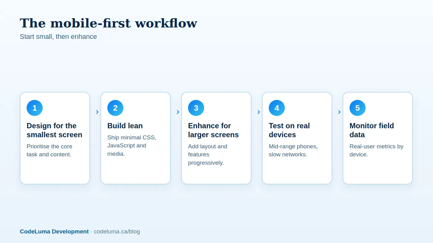
Mobile-first is both a design approach and a technical one. Designers start with the smallest layout, deciding what matters most when space and attention are limited. Developers write base styles for small screens and add media queries that enhance the layout as space allows, rather than writing desktop styles and overriding them. The result is leaner code, clearer priorities and a better experience on every device.

Know the real conditions
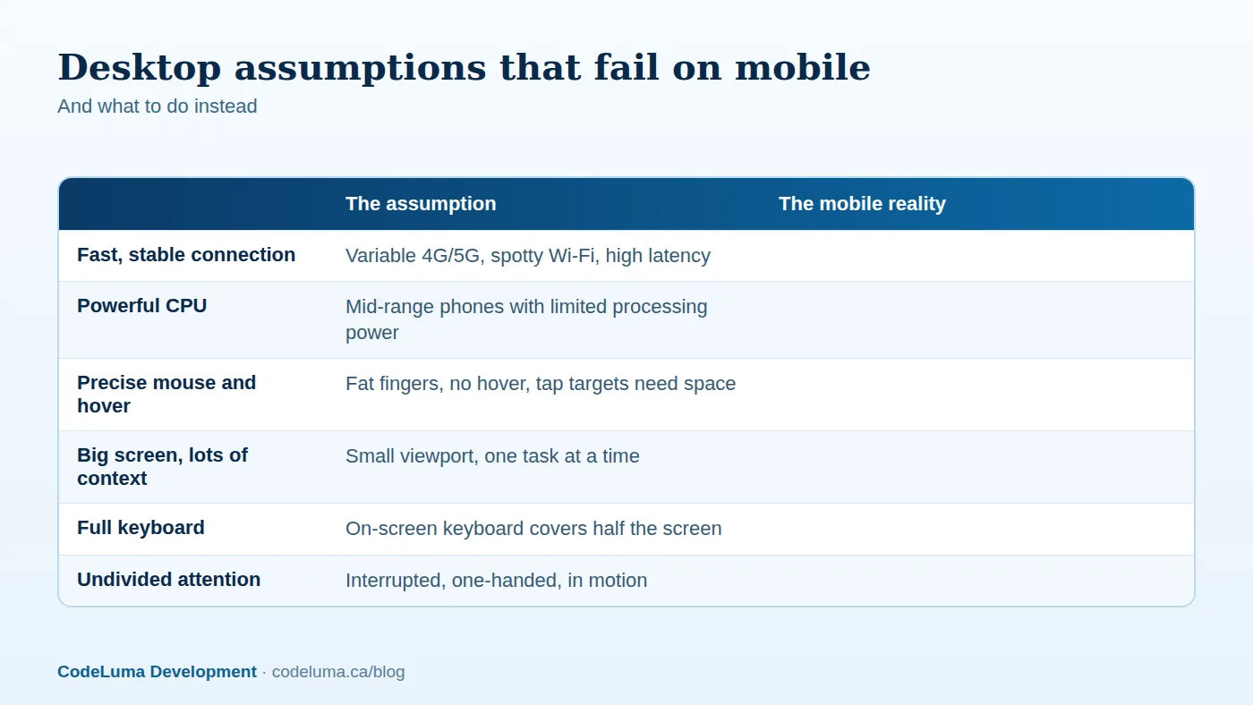
Your visitors are not using the latest flagship phone on fibre. Many use mid-range devices with limited processing power, on cellular connections with variable speed and latency, sometimes in low-battery or data-saver modes. Rural areas, transit and crowded events make connections worse. Test under these conditions: throttled network profiles, CPU throttling in browser tools, and a couple of real mid-range phones on your desk. If it works there, it will work almost anywhere.
Layout and content
- Prioritise ruthlessly. Decide the primary task, such as calling, booking, buying or getting directions, and make it obvious above the fold.
- Use a single-column flow with clear hierarchy, adding columns only when width allows.
- Write for scanning: short paragraphs, informative headings and bullets.
- Do not hide important content on mobile. The mobile version is what search engines index, so essential text, structured data and links must be present.
- Use responsive images and fluid layouts that adapt to any width, including unusual sizes and orientations.
- Set the viewport correctly and avoid horizontal scrolling.
Touch design
Fingers are imprecise. Make tap targets comfortably large, commonly at least 44 to 48 pixels square, and separate them so accidental taps are unlikely. Place primary actions within thumb reach, often near the bottom of the screen. Do not rely on hover states for essential functions. Provide clear pressed and focus states. Avoid gestures that conflict with the browser or operating system, and always offer a visible alternative to swipe-only interactions.
Forms and input
Forms are where mobile conversions are won and lost. Use the right input types so the correct keyboard appears: email, telephone, number, date. Enable autofill and autocomplete attributes, keep labels visible, and validate inline with clear messages. Reduce fields ruthlessly, offer address lookup, and support digital wallets and saved payment methods at checkout. Make sure the on-screen keyboard does not hide the field being edited or the submit button.
Performance on mobile
Speed matters more on mobile because of slower devices and networks. Compress and resize images, use modern formats, lazy-load below the fold, minimise and split JavaScript, and avoid large third-party scripts. Aim for good Core Web Vitals in real-user data for mobile specifically; our guide to Core Web Vitals covers the fixes. Reduce reliance on heavy client-side frameworks for simple pages, and consider server rendering or static generation for faster first paint.
Offline and progressive web apps
A progressive web app (PWA) can add installability, offline support and push notifications to a website, giving an app-like experience without an app store. Use service workers to cache the essentials so repeat visits load instantly and the app works with intermittent connections. For field teams, delivery drivers and customers in poor coverage, offline capability is transformative. We look at this in depth in our guide to offline-first PWAs.
Accessibility and mobile
Mobile and accessibility go hand in hand: support text resizing, sufficient contrast in bright light, screen readers such as VoiceOver and TalkBack, and orientation changes. Do not lock the screen to portrait or landscape unless essential. Ensure focus order and touch targets work for assistive technology users. See our article on the return on accessibility.
Testing checklist
- Test on real iOS and Android devices, including older or mid-range models.
- Use browser device emulation for quick checks, but confirm on hardware.
- Test with throttled network and CPU.
- Check both orientations and different font sizes.
- Test forms with the on-screen keyboard and autofill.
- Test with a screen reader and with keyboard navigation.
- Verify behaviour in in-app browsers from social platforms, which behave differently.
Measure what matters
Segment analytics by device. Compare conversion rate, bounce rate and task completion between mobile and desktop; a large gap points to mobile-specific friction. Track mobile Core Web Vitals, form abandonment and errors, and watch heat maps or session recordings, respecting privacy rules. Set mobile-specific targets, and review them regularly.
Web, PWA or native app?
For most businesses, a fast responsive website or PWA covers the majority of needs. Native apps make sense when you need deep hardware access, advanced offline behaviour, high-performance graphics or a presence in app stores. Cross-platform frameworks offer a middle path. A conversation with an app development team that builds for all three will help you choose based on your users and budget, not on fashion.
Put this into practice with CodeLuma
CodeLuma designs mobile-first and tests on real devices and slow networks, so your site or app feels fast and effortless on the phone in your customer's hand, not just on a developer's laptop.
- Website and web application development - fast, accessible, search-friendly builds.
- Mobile and app development - iOS, Android and progressive web apps.
- Custom software development - tailored systems, integrations and internal tools.
Start a conversation. Tell us about your project and we will reply with practical next steps, or browse all CodeLuma services. CodeLuma Development Inc. is based in Nova Scotia and works with teams across Canada and remotely.