On most websites, images account for the largest share of page weight. In an online store with hundreds of products and multiple photos each, they dominate. Oversized, poorly formatted images slow down loading, hurt Core Web Vitals, waste mobile data and cost you bandwidth. The good news is that image optimisation is one of the most reliable ways to speed up a site, and once it is automated, it takes care of itself. This guide covers the techniques that matter and how to put them into a repeatable workflow.
Start by understanding the problem
A typical mistake: a photographer supplies a 6000-pixel-wide, four-megabyte image, and the site displays it in a 400-pixel column. The browser downloads every byte and scales it down. Multiply by twenty images on a category page and you have a very slow page. The fixes revolve around three ideas: send the right dimensions, use efficient formats and compression, and load images only when needed.

Choose modern formats
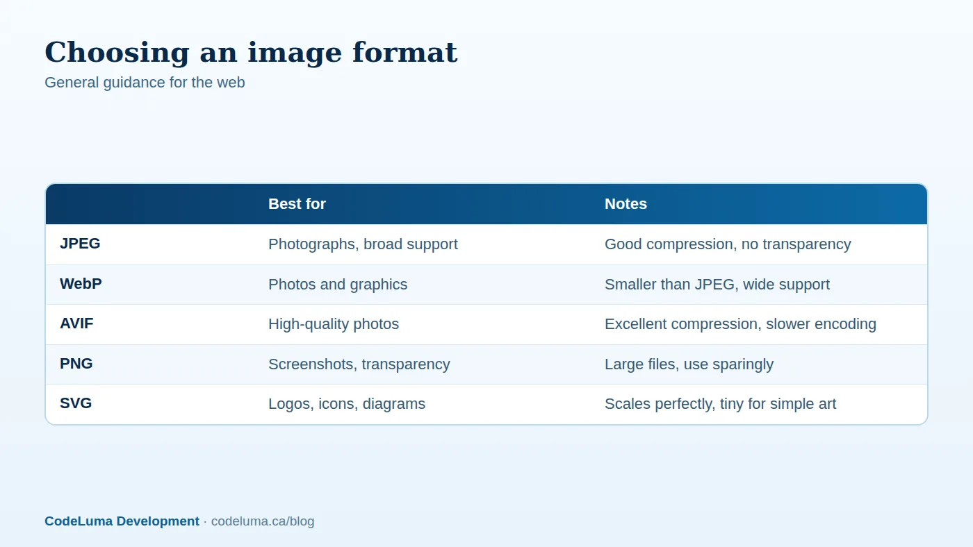
JPEG remains universally supported and is fine for photographs when well compressed. WebP typically delivers noticeably smaller files at similar quality and is supported by all major browsers. AVIF often compresses even better, particularly for detailed photos, at the cost of slower encoding and slightly more complexity. A common strategy is to serve AVIF or WebP with a JPEG fallback using the picture element, or to let a CDN or image service negotiate the best format automatically. Use SVG for logos, icons and simple illustrations, since it scales perfectly and is tiny. Use PNG only when you need lossless transparency and a modern alternative will not do.
Resize to the displayed size
Determine the maximum rendered size for each image slot at each screen width, and produce versions for those sizes, often called responsive image sets. Use the srcset and sizes attributes so the browser picks the smallest adequate file for the device. Account for high-density screens by allowing up to twice the displayed width, but rarely more. A product thumbnail displayed at 300 CSS pixels rarely needs more than 600 pixels of actual width.
Compress intelligently
Lossy compression at a well-chosen quality setting is usually indistinguishable to the eye and dramatically smaller. For JPEG and WebP, quality settings around the mid-70s to low-80s are a common starting range; check visually on your own images, especially skin tones, gradients and text. Strip unnecessary metadata such as camera and location information, which also improves privacy. Use tools that optimise at build or upload time so the work does not depend on people remembering.
Lazy-load below the fold, prioritise above it
Use native lazy loading for images that appear below the initial view so the browser skips them until they are close to entering it. Do the opposite for the main hero or product image: do not lazy-load the element that determines Largest Contentful Paint, and consider preloading it and setting a high fetch priority. Always specify width and height, or an aspect ratio, so the layout does not jump when images arrive. We discuss why layout shift matters in our guide to Core Web Vitals.
Use a CDN and long cache lifetimes
Serve images from a CDN so they travel a shorter distance, and set long cache lifetimes with fingerprinted file names so repeat visits load instantly. Many image CDNs can resize, crop and convert on the fly through URL parameters, reducing the number of variants you must store. Ensure the CDN caches transformed images so processing happens only once.
Handle e-commerce specifics
- Consistent dimensions. Standardise aspect ratios for product photos to avoid jumps and awkward crops.
- Zoom and detail views. Load the large image only when the shopper opens the zoom, not with the page.
- Thumbnails in lists. Generate small dedicated thumbnails rather than shrinking large photos with CSS.
- Galleries and carousels. Load only the first image up front; fetch the rest on interaction.
- Alt text. Write descriptive alternative text for accessibility and search, listing key attributes such as colour and material.
- Image sitemaps and structured data to help search engines understand product images.

Video and animation
Video is far heavier than images, so treat it carefully. Replace animated GIFs with short MP4 or WebM videos, which are dramatically smaller. Do not autoplay large videos with sound; use a poster image and load the video on interaction. Host longer videos on a streaming platform or a service that adapts quality to the connection. For background videos, keep them short, muted, compressed and optional on mobile.
Automate the pipeline
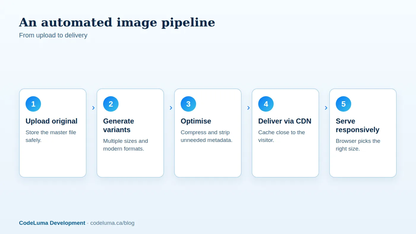
Manual optimisation does not scale. Build a pipeline so that every uploaded original is stored in its master form, variants are generated automatically in the required sizes and formats, optimisation happens without human involvement, and the delivery layer picks the best variant. Options include image services, CDN transformations, or a background worker in your own application. Add validation at upload: reject or auto-resize files that are absurdly large, and warn editors when alt text is missing. This makes good performance the default rather than something dependent on individual discipline.
Existing sites: a rescue plan
- Audit the heaviest pages and list the largest images and their displayed sizes.
- Bulk-resize and compress the existing library, and convert to modern formats.
- Update templates to use responsive image markup and lazy loading.
- Fix the hero and product images that determine LCP.
- Set up an automated process for future uploads.
- Re-measure and record the improvements.
Watch out for these traps
- Over-compressing until images look muddy; check on real devices.
- Lazy-loading the hero image and delaying the main content.
- Forgetting fallbacks for browsers that do not support a format.
- Serving different aspect ratios in different templates, causing awkward crops.
- Leaving originals publicly linked, so they get crawled and downloaded by mistake.
The payoff
A well-implemented image strategy commonly removes the majority of the bytes from an image-heavy page, improves LCP and mobile experience, and lowers bandwidth costs. Combined with the caching and hosting improvements we describe in our guide to Redis and CDNs, it is often the fastest route to a dramatically faster site. If your catalogue is large, a custom build with an automated media pipeline pays back quickly in both speed and staff time.
Put this into practice with CodeLuma
CodeLuma builds automated image pipelines for stores and media-heavy sites, so every upload is resized, compressed and served in the best format without anyone touching an editor.
- Website and web application development - fast, accessible, search-friendly builds.
- Custom software development - tailored systems, integrations and internal tools.
- Managed hosting - monitored, backed-up, Canadian-friendly hosting.
Start a conversation. Tell us about your project and we will reply with practical next steps, or browse all CodeLuma services. CodeLuma Development Inc. is based in Nova Scotia and works with teams across Canada and remotely.